by Jas Faulkner
 It all started with one of those thrift store finds that moves you to dust off and rekindle an old interest. I was there to do my biweekly stuffed animal grab for Niklas Lidstrom -aka- Destructo the Wonder Shih Tzu when I saw they had cobbled together roughly fifty dollars worth of calligraphy supplies into a ziploc bag and with the asking price of five dollars.
This is probably a good place to hit the pause button and admit that I’m a big old typography nerd. It was a love of letters and alphabets of all kinds that pushed me to major in graphic design at one point in my overlong undergraduate career. I am still a sucker for typography books and, like any good bibliophile, mourn my 80s’ era spiral-bound typo stylebook.
Why is the mention of the decade important? My generation was one of the last to learn old school cut and paste graphic design. Printing technology made it possible to create pieces with a simple stroke of a pen or swipe of an X-acto blade. Compared to the previous decades of modern advertising art, this was a fairly short period before the advent of microcomputers (you kids call them PCs.)
By the mid-1980s, lettering was faster and easier. This was not because people were treating penmanship as a necessary social/vocational tool. In fact, the opposite was starting to be true. Fonts were photocopied and graphics were composed of letters that had been cut or chemically transferred. The idea of learning pen and brush strokes was available, at best, as a curiosity from a bygone day.
 Those books spoke to the hours of waiting in line for the next available photocopier and the impact cinematic art direction and MTV would play on commercial style for the next decade and a half.
Once I discovered the joys of rummaging for old art school books, I saw that the books from previous generations had a lot to say about the may commercial illustrators and typographers were trained in t he past.
Modernized Methods In The Art Of Lettering For Commercial Purposes by
William Hugh Gordon (1918 Signs of the Times Publishing, Cincinnati, Ohio) briefly addresses the evolution of lettering, gives a quick rundown of the tools , and then moves on to detailed suggestions for the best compositions for various applications of commercial typography. A quick look through that section reveals the proper way to put together theatre showcards, invitations, department store signs, and about a dozen other possible uses including title cards for silent movies.
Lettering From A to Z by Clarence P. Hornung (1946 Ziff-Davis Publishing, Chicago New York) delves into the composition of the letters themselves. Entire chapters are devoted to the history of each letter in the Roman alphabet and the development of letterforms as expressive devices. The introduction was written by Frederic Goudy. 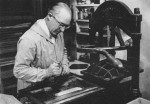
Yes, THAT Frederic Goudy.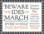
I showed these books to Stan, a friend who is a retired commercial illustrator and instructor. He regarded them with bemusement.
“They were most likely used in business colleges that also offered commercial art and drafting. Sometimes conservatory type programs and baccalaureate degrees offered lettering and typography, but it was treated as necessary evil for artists to survive. Intensive academic training didn’t start until well after Modernists adopted text as an element in fine art in the very early Twentieth Century. You have to realize that the establishment viewed those early attempts at combining letters with more traditional forms of painting as being, well, punk-like. This would be true all the way to the 1960s and 70s.
“Much of this spoke to the economic divides that manifest themselves in fine arts education. Before Pell Grants were so easy to get in the 70s and 80s, you either had to be phenomenally good at something and lucky enough to get noticed so you could get a scholarship or you had to be wealthy enough to pay the tuition required to go to a university or conservatory. It’s reaching that point again, unfortunately.
Artists who were poor but talented and determined got their training where they could. YMCAs, YMHAs and their feminine equivalents, artist-run educational collectives and vocational schools were the way many people started their training. They often finished it by apprenticing to in press shops, high end calligraphers, and the artist shops of advertising firms. Sometimes they ended up making a living more easily then their counterparts at Yale or Parsons. ”
What about typography today? Stan agrees that computers and the culture of sharing creative work on the internet has leveled.
“It’s by equal measures good and bad,” he said. “The bad is that there can be an echo chamber effect that happens when artists pull from pop culture for inspiration. There are eight jillion fonts that mimic television and movie titles. They’re fun, but the gimmicks give the discipline a toy feel. The good is you do see artists taking chances, being innovative in a way we have not seen since the late Eighteenth Century.”