Another terrific article from one of our regular contributers. Take a moment to say Hi to Nora at Rainy Day Paperbacks. If you’d like to contribute a posting just send me an email (editor@bookshopblog.com)
*****************************
When you have a limited amount of space, you must make the best use of what you have. This means you need to keep track of what is contributing to your bottom line and what is just sucking up valuable real estate. You can look at the raw numbers, but sometimes a visual representation of what’s going on will help you better determine what actions you should take.
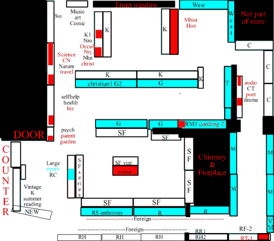
This is a very, very basic analytic planogram of my store layout showing what’s selling, what’s not. This simply shows which sections are selling very well (blue), average (white), and which ones are under-performing (red) compared to how much space they take up.
The basic idea here is that sometimes items sell poorly because they’re in the wrong place. What seemed like a good idea at the time doesn’t seem to actually work. Your logic didn’t match your customers’ logic.
These are three different 6 month shots of the layout of the store. As you can see, it’s kind of oddly shaped. I have to try and work around some oddly placed interior walls because I’m in a converted Victorian house. At least the floors are level!
Note: These maps are not to scale. They just give the general proportions and layout. The sales counter shows a square wall behind me, but it’s actually a half hex. I just didn’t feel like drawing that.

Here’s how it looked a year ago. The blue sections are performing above expectations, based on how much space they use verses how many items I sold in the previous six month period. Mystery, general fiction, romance, thriller, western, and some small sections are doing very well.
Many of the nonfiction sections in the back are doing extremely poorly. They’re labeled in red. There’s also a section in the sci-fi area that’s doing poorly.
To see if moving the nonfiction will improve sales, I swap it to a location that is doing well, the mystey. It’s right up front. Improved visibility should help the nonfiction. The mystery readers will still find the section.

On map two, you can see it sort of helped… and hurt. Mystery slows down some. This is mildly concerning, but that’s traditionally my slow half of the year, so not unexpected. You can see some other sections slide from “above average” to merely “average”.
However several of the nonfiction sections flip out of “waste of space” to “average”.
On the third one I’m again looking at the profitable half of the year. This is what the layout looked like at the beginning of November. (it covers the same 6 month period, one year later) as map one)
Mystery once again goes into “above average”. Several other sections switch from average to above average. More importantly, there’s less red! Ideally I’d like to see those nonfiction sections go blue, but I’ll take average to start.
Now, there’s another component to this. The color coding makes it easy to visualize what’s happening on the flat. There’s also a vertical component. Some cases are a mix of poor , average and above average, so are only partially colored, roughly in proportion to how much space the section is occupying. The labels are also coded, to provide info on what shelf they occupy. In cases with multiple sections, they go roughly in labeling order of top to bottom. If it was unclear, I added a number indicating what shelf it was on, with #1 indicating the start of the sequence.
This shows off a pattern. A section is likely to do poorly if it is on the very bottom of a case or the very top. Why? People can’t see things below their knees and can’t reach things above their heads! They have to REALLY want it to get down on the floor or climb on a stool. Thus the trick is banishing things to the top and bottom that people are willing to do that for. And are capable of doing so! As tempted as I am to banish parenting (a poorly performing section) to the top or bottom of a case, pregnant ladies aren’t inclined to sit on the floor or climb on a stool unless there’s absolutely no other way to get at them.
In the third view you can see a long line through the romance section marked “foreign”. I banished all the foreign language to the bottom shelf in those sections. If I look at the real sales numbers for Romance, I probably should have colored it radioactive blinking blue since it isn’t just outperforming, its doing four times the average! To make space for that foreign language, I got rid of some romance which made sales go up. Go fig. This can almost entirely be attributed to everything now being visible, so the authors at the end of the alphabet that had been languishing on the bottom shelf are suddenly hot buys because people can finally see them!
As to the foreign language, it still sells perfectly well on the bottom shelf. It takes up a lot of space, but its EXPENSIVE, so makes up for it in dollar volume. It sells just as well there as it does at eye level because virtually nobody buys Spanish or German books on whim. They ASK where they are and spend twenty minutes browsing.
But what to do about the rest of those red items? Time to shuffle them around and see if they can do better elsewhere. I’ll also try some other tricks to try and turn them around, but that’s best left to another post.
Rainy Day Paperback Exchange
Bethel, CT
gently used books for kids and adults
http://www.rainydaypaperback.com
Other Posts by Nora Killing Sections | Building your client base at Fan Conventions
Fine job of setting up and you did this inside of a converted Victorian house. –
I’m impressed.
Question. Can you come over and sort out my books? (Plan on staying a month or two)
All joking aside. I wonder if there is something to be learned here for arranging online stores. Should a category list be arranged so the slower selling items (red) are between the blue and white for example.
It looks like you have the fireplace covered. Ever think of opening it for a reading section? – Maybe you better not. Customers would want to sit, relax and read while you serve them wine, crackers and cheese. (Gratis of course)
Good work…
This gives some idea about arranging the things in stores and colouring gives good impression about the stores appearance.
prying1, every time we see someone advocate putting in a reading area we think about opening up that fireplace…
And then immediately chuck the idea. The map isn’t to scale, so this looks way bigger than it is. There’s less than 450 square feet of space! Every inch counts. You can see why I’m so zealous about sections needing to carry their weight.
We make up for the tiny space some during the nice weather by having some rolling racks outside that have the discount items on it and we have chairs outside. (another business behind us kindly lets us store the rack back there at night and when its wet) In the slower winter months, rack usually stays in and the chairs get put away. People will just have to read at home curled up with a blanket.
Which is probably a good idea ’cause with a converted Victorian, boy is it drafty. Draft sealing the windows with plastic helps some, but the lack of insulation in the original walls means it gets chilly. The bookcases ARE the insulation!
Hope to see all blue in your post!!. Do you use any planogram software?
No, I use Excel to calculate the raw numbers. They I just use a stock map of the floor plan I drew in Fireworks. I just go in and label the cases I moved, then dump color on stuff.
This is actually a big upgrade of the map, since previously I’d just done a quick sketch on a piece of paper, scribbled on the items codes, and then colored with markers!
I did the nicer computerized map do people didn’t have to read my handwritten notes.
The real key is getting the data, which you can do with any database or spreadsheet program that you keep your inventory and sales data in. If you’ve got it in your head or only hard copy, well, that makes this all very hard…
its looks much professional job. I must say i am impressed the way you have mentioned this article and design of room. I really appreciate about this. Best wishes for more work like this.
wow, wish id have the determination to do organizing like that 😀 some are just plain lazy i guess