 My favorite book cover artwork was rendered during what is loosely called the Art Deco period. That term is being used extravagantly these days, to incorporate years far beyond the
 1930s which I always thought of as the cut off. Stylistically, Art Deco has been stretched like a rubber band–eventually it will snap, and nothing and everything in illustration will be labeled ‘Deco.’ I’m guilty of identifying much of my particular likes within vintage illustration as ‘Deco’–I can’t describe the style, but I know it when I see it–sort of like, I don’t know great art, but I know what I like, ha. The book cover art I especially am drawn to has bold lines and colors, a Clarice Cliff look, but on paper, not ceramics. I thought I’d share some of my favorite book covers, illustrations, and paper ephemera from this period.
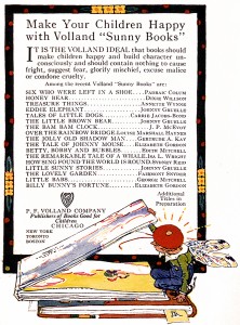
Mary Engelbreit, the well known and popular card, book, and gift illustrator borrowed liberally from the style I am most enamored of–the period in the 1920s and early 1930s. During that time period a publishing company named Volland was responsible for the children’s ‘Sunny’ books–never a sad story among their titles–each book had a similar style to the others, although illustrated by different hands. From Aleph-Bet:
“1908, German born Paul Frederick Volland founded the Volland Company. Originally intending to publish greeting cards that would compete with the European dominated industry,by 1917 Volland had transformed the
company into a nine acre plant that now included calendars, and books for adults and children. Through Volland’s vision of publishing high quality, mass produced books, his books for children proved to be amongst the most successful.”
P. F. Volland published Johnny Gruelle’s first book, and the company’s fortune was from thence on assured. Gruelle created the iconic Raggedy Ann and Andy, and was one of the first to market toys based on his books.
Gruelle’s artwork was the exception to the stylistic form most Volland titles had in the late teens and throughout the 1920s. Volland was able to bring in some brilliant illustrators-among them: Janet Laura Scott, Gertrude Kay, John Rae and Katherine Sturges Dodge. Unfortunately, a quite bizarre story is connected P. F. Volland. Depending on what source you read, and there aren’t that many, Mr.Volland signed a contract for a
Washington’s birthday motto with a little old lady way down south, who made the long trip to Joliet just to see him. It was to be on commission, if the motto made money, she made money, if not. . . It didn’t. However, the little old lady wasn’t pleased with the outcome and became convinced she was being swindled out of all those cherry tree and false teeth profits. She made the trip north a second time, entered Volland’s office, and shot him dead. The other version– she wanted some painting returned–I’m going with the first. Despite its founder’s untimely death, the company flourished–for a bit. By the end of the 20s, profits were down, the stock market crash put a crimp into the coffers, and they sold their inventory to another company who commenced to reprint many of the gorgeous Volland titles.
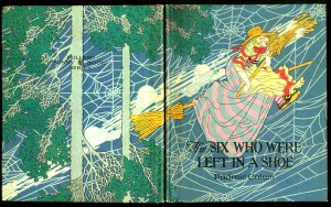
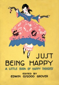
Just Being Happyis a typical Volland sayings, motto, or poem gift book. Usually small square thin books, the outer jacket is bright and colorful, with wonderful endpapers. Others
boast an illustration for each poem. Just Being Happy has no interior pictures, as opposed to Just For You which has one gorgeous illustration for each of its meager five poems. The illustrations by Elizabeth Gordon are worth the price. Volland’s greeting cards were printed on thick card stock, and were postcard like in shape, but a bit larger and with cleaner lines and bolder colors than what Victorian and Edwardian cards had. The artist is usually not credited for these cards, which is a shame, the work is as brilliant as their book illustrations.
Children’s books by Volland are extremely collectible, and expensive, if you are opting for a first edition, first printing, in original box. The illustrations are like candy, all peaches, pinks, rose, periwinkle, teal–beautiful ‘happy’ colors. Titles included: Helping The Weatherman, Winkie, Twinkie, and Lollypop, The Princess of Cozytown, The JollyOld Shadowman, Tales of Little Dogs, Omar, the Discontented Cat, and Gabby Gaffer. They are highly collectible titles today mainly for the
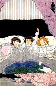
gorgeous illustrations–the stories and poems are fairly forgettable. I own one or two of the prized pieces, but learned later that for my purposes a used slightly battered edition was just fine–IF and it’s an important caveat–if the illustrations are crisp, bright, and within register–meaning, when printed the inks were placed correctly and are not like crayoning outside the lines of the drawing. I have bought a couple of reprints, and although not as perfect as a first edition, they are quite nice. By the end
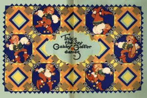
of the 1930s, Volland was no more.
I was under the impression that another company, Buzza, was part of Volland–not true. Buzza, famous for their mottos, framed illustrated poems, was begun in 1907 Minneapolis by George Buzza .
About.com: “Buzza was considered to be a pioneer in his use of color and the variety of papers used in the greeting cards.”
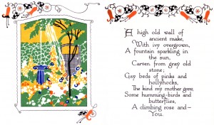
Mottos consisted of short sappy sayings by Edgar A. Guest and others, about friends, home, mother, and keeping your chin up. A gorgeous luscious vivid illustration to accompanied the poem. At one point I was in a frenzy to collect every motto that had a storybook cottage illustration. Which is nearly all of them. I think I may have accumulated 12 or so before I saw the error of my ways–no space to hang them all, no space to store them either. I have become obsessed with red roof cottage illustrations, so much so, that on flickr I’ve been known to write on someone else’s stream–Red Roof Cottage Alert, if I spot one within their pictures. Engelbreit 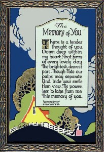 has made a small fortune from expanding upon the vintage styles, with the red roof cottages a big part of her work. Scotty dogs were also the pet of choice, maybe because the long term president owned one, but more likely just because it was that breed’s moment in the spotlight. Scotties are on dust jackets, playing card backs, and bridge tallies. They show up in mottos too.
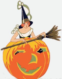 Buzza was the main producer of Deco flapper bridge tallies–these were the little die-cut pieces bridge players used to keep score–and bridge was an extremely popular past time. Unlike today, where being solitary with some mechanical device is preferable to human company, people gathered around a table and played a card game with serious intent. Practically every well bred lady would have bridge luncheons and these colorful flapper die-cuts would be accessories to the game. There were holiday bridge tallies–Christmas, and Halloween being the most popular, but every little bitty celebration had a corresponding tally. And then there were the cottage tallies–storybook cottages with yes, sometimes, red roofs. Whatever the occasion, or if a regular meeting date, bridge tallies were there to spark the game with color and class. These tallies have become, sigh, collectible, naturally. So now they are almost impossible to find for a few bucks. And forget about Halloween tallies–I’ve seen someone bid up to 100 dollars and more for 4 Deco ladies with the same spectacular dress–I didn’t go that far, but I sure would have loved one of them.
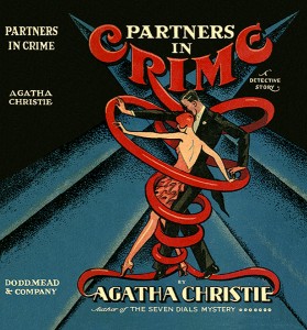
Some dust jackets from the early 30s reflect my criteria for Deco style. Many in the crime fiction genre have brightly colored bold illustrations that arrest the attention. I wrote an article on one publisher’s entire line having Art Deco covers. The Mystery League covers were an extreme example, however, artists during this period tended to follow a Deco sensibility, if not pure Art Deco. By the late 1930s dust jacket and magazine style illustrations had shifted away from the Deco look. More magazines were using photographs for their covers–Vogue being one of the most famous. Before this point, their magazine covers were stunning, startling, avant garde and a huge
dessert for the eye. Along with books, mottos, greeting cards, bridge tallies, I did collect magazines. Vogue–out of my league, but some front covers had been made into posters back in the 1970s, a
nd I had them plastered to my dorm walls. There’s nothing so exciting to see than a Georges Lepape, George Wolfe Plank, or Helen Dryden extravaganza. They were pioneers of a particular style. Most of my favorite pieces are from before the 1920s, the period between 1912 and 1920, although believe me, the years after weren’t too shabby in quality and design.
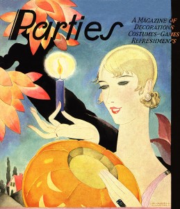
This period of commercial illustration was abundant with different artists penning similar, but not exact styles using the bold lines and color. There is no way toestimate how many bridge tallies were produced, or greeting cards with this style. I come across unseen tallies all the time, and crave to own each one. Some magazines are lost–their covers not seen for decades until someone somewhere has one up on ebay. And I won’t even touch the paper product company Dennison’s decision to destroy their old stock samples–one woman stood between everything going poof, and only half–she managed to save that much. What were they thinking?
Dennison, Beistle, and a couple other companies were the prime providers of holiday paper decor, and collectors seek out their products endlessly. From crepe paper banners, 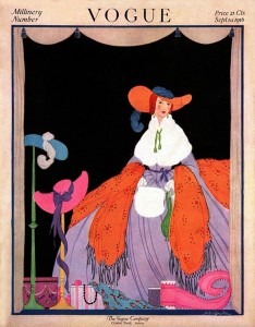 napkins, to die cut black cats, these prized pieces are dwindling in numbers, collectors have them squirrled away from sun, air and other people. Uh, I happen to be one of those. Alas, my collection is slim and the constant rise of prices will keep it that way. Dennison party catalogs showcasing their Halloween products for each year from 1912 to the early 30s are not only beautiful examples of Deco illustration, but historical in nature–some of the products shown are no longer in existance, or if they are, unseen for many a year. Unlike other holidays, Halloween paper products were used a great deal, and then chucked. The exact definitiion of ephemera. Not created to last.
Hopefully if you’ve persevered this far into what is Moby Dick length in internet pages, you’ve enjoyed the pictures and info, but not so much as to start collecting any of it. There are enough competitors out there!
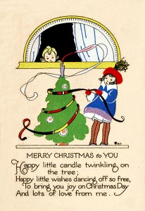
Here’s a Mary Engelbreit card–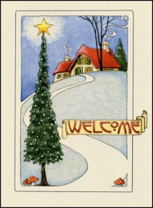 and here is a vintage card from the 1920s–
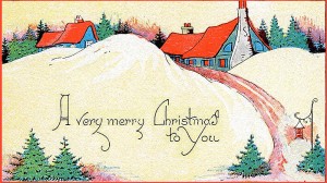
For a link to Aleph-Bet Books go here
