A fellow approached the register with a stack of books last week and the strange assortment of titles provoked me to wonder. What peculiar circumstances had led this man to such incompatible books? I don’t even remember which books they were now, but it turned out that the explanation was the exactly what you would find, if you aimed for the simplest and most sensible. He was a book cover designer. With that in mind, his selections all made sense; and that led to an interesting discussion of book design. For several years there was one trend in book design that had been irritating me, and this was my chance to chivy out some inside dope from someone positioned to know. “What’s with the pictures of women on book covers who are shown only from the middle of jaw down?” I asked. This is a peeve I’ve developed, like a squeak in your car that, once you notice it, drives you crazy. I saw these decapitated pictures everywhere; there were even some, though many fewer, headless men on book covers.
[Also: The Best Book Covers]
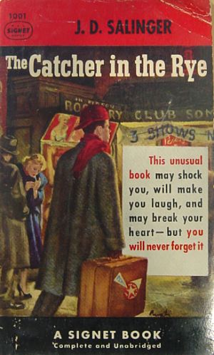
Designers today seem to have moved on from this distasteful fad, and I don’t see so many now as three years ago, but if you start looking for them on the shelves of used bookstores, you will find them in surprising numbers. So what did my expert have to say on the subject? “That’s funny,” he said. “I’d never noticed it before.” Still, I learned a lot about modern book jacket design. I don’t know anything about his designs, but to my taste, the current state of the art is uninspiring. I suspect that it has something to do with where the publishers find today’s crop of designers; from the graphic design programs of today’s four-year art schools. The designers of the 1950s, for example, were typically painters for whom book jackets paid the rent. The best of them, at least the most  renowned was James Avati, who designed paperback covers for nearly every great writer (see accompanying Salinger cover) you can think of in the 1940s and 50s. His paintings were richly crowded with characters and menace, and provocative women. And there was Robert McGinnis whose distinctive artwork was on many Perry Mason covers. Artists like William Gillies painted covers for Hardy Boys and Nancy Drew books that were usually better than the books. There were countless uncredited artists, whose names we’ll never know, who illustrated many of the 1,000s of mass market paperbacks that came out after the war, but they all did something that few of today’s designers are doing – painting on canvas. For better or worse, today’s designers are creating digital designs and you can see the results in the minimalist, geometric designs now in fashion. The New York Times has a feature online now that presents a slide show of the best book cover designs of 2012, chosen by the designers themselves.
http://www.nytimes.com/
Take a look. If there is a painting in the bunch, I can’t find it. And noticeably absent from these designs are human beings; of 19 designs there are two with people in them. Mostly there is stylized typography, geometric shapes, photographs and computer graphics. What a change from 50 years ago. One of the top designs is for “The Yellow World” by Albert Espinosa. It consists of a yellow circle on a blue background – nothing else. No title, no author, no words at all. How is that going to sell a book? Was the author drugged and hypnotized to agree to it? And what does it say about the state of design today that of all the books published in 2012, this is what the professionals judged to be the best?
 I am thinking about book covers this week because I have been dealing with a large collection of vintage paperbacks, some pulp crime, westerns, science fiction and some classic literature. The cover are so evocative – lurid, colorful, tempting – these guys knew how to sell product! For many years there was a strong collectors market for these old paperbacks, but the prices have fallen steeply since Ebay made obvious how many are still available. But I’ve had good luck selling vintage paperbacks with interesting covers for $3 to $10; books that would generate no interest if not for the covers. Maybe there is some part of the business that I don’t understand, but I know that covers sell books, and I think that publishers today are not making my job any easier. It makes me want to write a book, just to see if I could get a Rudolph Belarski painting underneath my name. And it wouldn’t matter how bad the book was, there will always be a market for a racy picture and a suggestive title.
