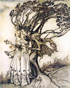
When I first discovered golden age children’s illustration, Arthur Rackham reigned supreme. I was enamored with his fairies, elves, sprites in various forms–from Peter Pan, to English Fairy Tales, to Rip Van Winkle and The Wonder Book. Not able to afford first editions, even then, I settled for typical reprints. Not exactly the finest copies, at least they made more of his illustrations available to me than did the David Larkin outsize paperbacks showcasing the various artists. After a trip to London and a bunch of postcards later, I was so transfixed by his art, I decided to write a thesis for a theatre class in college. The thesis had three
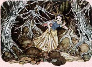
parts. The first, a written analysis of his work and influence, second, makeup based up his characters, and third, a small production utilizing aspects from his artwork. I can’t for the life of me remember what the makeup consisted of, nor what the small production was all about–but I still have my paper–with grammatical errors, misspellings, and postcard examples of his work, still intact.
Back in the day, as the kids say, I didn’t type my papers. Whaaaaat? you exclaim? Was such a thing possible? Barely. But for me to try to type caused all sorts of difficulties, mostly frustration so dire, a large heavy missile could be flying across the room if things went badly. For the professors who were a bit more relaxed, I hand wrote. If not, I had to hire someone. Within the long form paper, I adhered various postcards from Green Tiger Press, pieces from London, and xeroxes of artists that came before, and since. I wrote a fairly detailed analysis of the influences upon the artist, and those he in turn undoubtably influenced. My contention of Pre-Raphaelite artists being a huge contributor to his style, isn’t anything earth shattering or new. But I do think that most people wouldn’t put Rackham and Walt Disney together. Disney was clearly heavily influenced by Rackham. He would have been a kid when many of Rackham’s works were published, and was quite aware of the muted tones of brown that Rackham used, almost as a signature, at least it seems to me. The anthropomorphic trees in Rackham’s illustrations were carried on by Disney in various projects. But the most obvious piece of work by Disney that bears Rackham’s style is Snow White, which was released in 1937, two years before Rackham’s death at 72. Artists such as Brian Froud, admit to being heavily influenced by Rackham, and others, such as Michael Hague, I see a definite echo
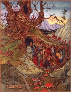
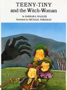
of the Rackham style in their works, in particular, Teeny Tiny And the Witch Woman illustrated by Michael Foreman. Foreman’s trees in this title are terrific. Michael Hague’s world has touches of Rackham in every corner. Elves live in trees, as they all should, but in a manner that honors Rackham with Hague’s signature style. Foreman’s style is very different from Rackham’s or Hague’s but the spirit of Rackham comes through.
William Timlin, a contemporary of Rackham had a style so close in similarity, one could almost accuse him of stealing Rackham’s art. Nonetheless, his one and
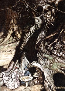
only book, The Ship That Sailed To Mars intrigued me enough for it to be my one and only really rare and expensive children’s illustrated book.
Friends’ gifts often included reprints, bios, etc. of the artist. I had posters from Peter Pan in Kensington Gardens, calendars, everything you could think of that bore his illustrations. Over time, either I tired of seeing his work, or I evolved, because today, I do not count him at the top of my favorite golden age illustrators. I was aware artist Edmund Dulac, Charles and W. Heath Robinson, Kay Nielsen because they were showcased, again, by the David Larkin series of books. Kay Nielsen I enjoyed, but didn’t find as mesmerizing as Rackham. Now, it’s the opposite. Kay Nielsen enthralls me. His work for the book In Powder and Crinoline has become my favorite work of illustration, outside of anything by Anne Anderson. I think the explanation for Rackham’s fall from favor with me, is his color palate. Unless you’ve a first edition, the subtle blues, greens, sometimes reds are barely visible. The reprints in cards and books are brown brown brown. Despite his delicacy of line and whimsical depictions of elves, fairies, even humans (which by the way, the men all looked like himself) I prefer color. And Art Deco lines. Kay Nielsen’s work has both aplenty, and I find his work to be inspirational in a way Rackham once was when I wrote my thesis.
It could be familiarity breeding contempt, but I’m not asserting Rackham isn’t a brilliant artist, and popular illustrator, then and now, far more popular than Nielsen was or is, I love his work still, just not as passionately as I once did. Maybe first love faded and a mature one has taken it’s place!
For a nice look at Arthur Rackham’s bio and his collected works go here

I have numerous books illustrated by Arthur Rackham – they are a delight to behold. I like his illustrations to “Goblin Market” by Christina Rossetti. I love books from the Victorian era that are populated with pictures of Fairies , Elves, Brownies and the like. I collect them and try my best to encourage people to buy them and to encourage an appreciation for such books. For me – art deco is the bomb!